When you’re fundraising online, your nonprofit donation page is a crucial part of gaining and keeping new donors for your organization. If your page is hard to use or unrecognizable, it can keep your supporters from giving the donations they want to give. Figuring out how to make the best donation page for your organization may seem tricky, but luckily, there are some useful tips you can keep in mind to create and design a great one. Implement some of these best practices to create a better donation experience for your donors.
- Donation Page Best Practices
- Donation Form Best Practices
- Event Registration Best Practices
- Thank You Page Best Practices
- How to Increase Traffic to Your Donation Page
Donation page best practices
#1. Make your donation page mobile first
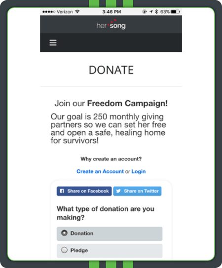
Nowadays, over half of internet users browse the web from a mobile device. To reach all of your donors wherever they might be, your donation page needs to look just as appealing and be just as easy to use on a mobile device as it is on a laptop or desktop. If your form isn’t optimized for mobile, you could be missing out on a large chunk of donations!
Most online giving software will automatically generate a mobile-responsive version of your online donation page for you, so if you’re using software, you’ll have one less thing to worry about!
However, it’s still best to design with mobile in mind. Use large text and buttons and keep your layout vertical to ensure your page will look amazing on phones and tablets.
Takeaway: Creating a mobile version of your donation page makes giving on the go easier for your donors, resulting in more mobile donations.
#2. Keep branding consistent
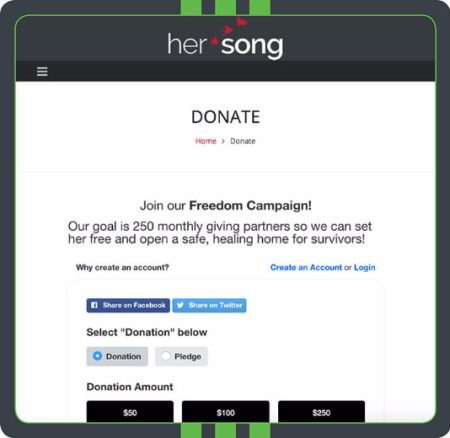
Branding creates consistency, which is key to establishing trust with your donors. Using a donation form that doesn’t match the rest of your website can create confusion and leave your donors wondering if they’re actually giving to your organization. In other words, using a branded form will make your donors feel more comfortable about giving.
When designing your form, it should reflect the look and feel of your organization’s website.
Use the same color scheme, imagery, font, and language as you would throughout the rest of your site. Additionally, include your logo in the top left corner so your donors can be immediately sure that they’re using your nonprofit’s donation form.
Takeaway: Maintain consistent branding on your donation pages to reassure your donors of the security of their contributions.
#3. Reiterate your story
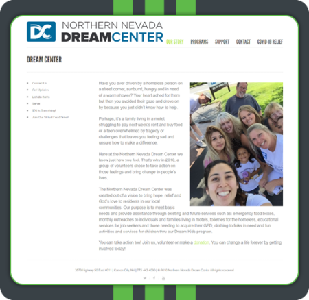
Your supporters give to you because they’re passionate about your cause and care about your story.
That’s why along with your nonprofit’s About Us and Mission Statement page, your online donation page should reiterate your story. Reminding your supporters of why your cause is important can motivate your donors to continue giving or even increase their gift size!
Include your mission statement clearly at the top of the page and make sure your nonprofit’s donation page tells the story of its particular campaign as well as its place within the broader context of your mission. This way, your donors know exactly how your organization is using their gift to help the ultimate cause.
Takeaway: Reiterating your organization’s core story and mission is key to growth and more meaningful relationships. Remember, quality is better than quantity.
#4. Maximize the top of your donation page
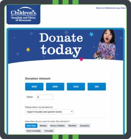
First impressions are important. Your donors should immediately know they’ve landed on a charitable donation page. Your form should be emotionally compelling, and your mission should be clear.
Nonprofits have the advantage of a noble cause on their side, and these causes are naturally emotionally compelling. Use that to your advantage! To really make your form tug at your donors’ heartstrings, include a short, impactful headline and a stirring image of those you serve at the top. It’s also a good idea to include a brief blurb at the very top of your form that gives your donors the rundown of your mission and what you hope to achieve.
Takeaway: Make your nonprofit’s donation page eye-catching and emotionally appealing. Include a picture and a memorable headline.
#5. Make your donation page & form secure
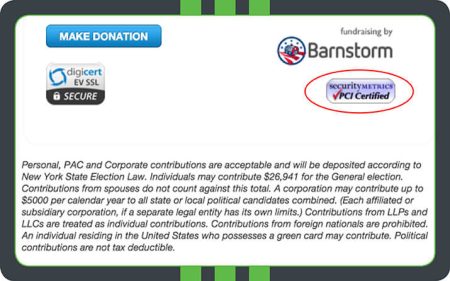
Your donation page will collect some of your donors’ most sensitive data, like their addresses and payment information. When you ensure your page is 100% secure, you’ll give your donors and your nonprofit peace of mind knowing that confidential information won’t be mishandled. Donors will be far more likely to give to your organization if they know your nonprofit has put every security precaution in place.
Using online giving software with a secure payment processor should give your nonprofit the proper tools to keep your donors’ sensitive information safe. However, it’s also important to emphasize the security of your page to your donors. One of the easiest ways to do so is by placing security certification icons on the bottom of your form so your donors will be 100% sure that they’re completing a form that takes their security seriously.
Takeaway: Reassure your donors that their donations and information are safe by adding certification logos on your donation page. You’ll see more donations for it!
#6. Don’t lead your donors away— No distractions

The main goal of your donation form is for your donors to successfully make it to the end and complete their donations. Don’t do anything that’s going to detract from that! Removing links and navigation eliminates distractions to make your donation form the sole focus and purpose of your page.
The only purpose of your form should be to collect donations, so remove anything extraneous that could distract your donors from their mission to give. Sidebars, navigation, and anything else that could potentially lead your donors away from your page should not be included.
Takeaway: To prevent abandoned donations, remove navigation menus, sidebars, and other distractions that may lead donors away from your donation page.
#7. Don’t neglect donation page design
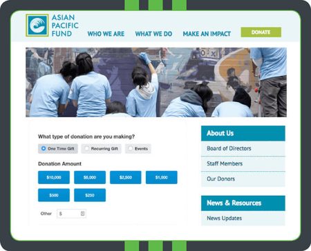
Your donation page is a reflection of your nonprofit, so it should be both functional and beautiful! In fact, according to our generational giving report, 33 percent of Generation X donors say they’re put off by outdated websites. Styling your page with fonts, colors, images, and more not only enhances the donors’ giving experience but also keeps your donation page looking fresh and modern. Add a fundraising thermometer for specific donation campaigns to add visual motivation for your donors. Additionally, designing your form can make it look more professional and authoritative, which establishes more trust with your donors.
Brand your form to your organization, and use easy-to-read fonts, professional-quality images, and complimentary colors. Your form should be aesthetically pleasing but also be a reflection of your nonprofit’s brand.
Takeaway: Design elements are what will help make your donation page stand out in a crowd. Don’t forget to make your form beautiful!
#8. Reduce repetitive information
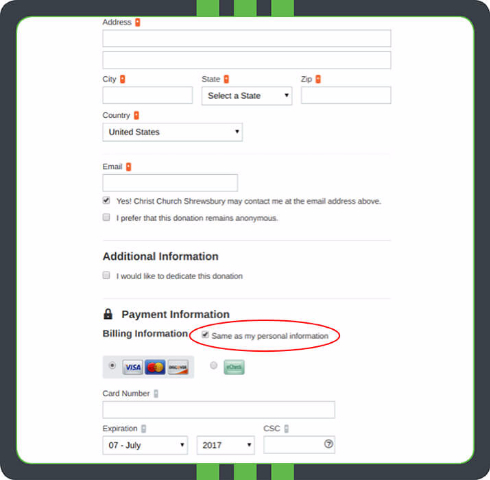
Another way to simplify your form is by reducing repetitive information. For example, people often have the same billing and shipping address. Don’t make your donors fill in the same information twice. The shorter and easier your donation form is to complete, the more likely your donors will be to submit their donations!
If you’re including fields on your donation form that might overlap, design your form so that your donors aren’t repeating information. A common example is shipping and billing addresses. Most online donation forms will allow you to place a checkbox on your form that donors can click to autofill their billing information if it’s the same as their shipping address.
Takeaway: Limit the number of steps that donors have to take to get to the end point for the highest conversion rates on your donation form.
#9. Map out your donation page’s structure
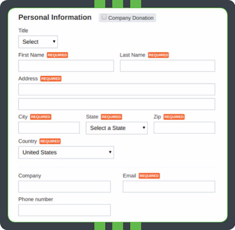
You should have a plan in place before designing your donation page. Know exactly which fields and questions you need to include and how to order them in the most intuitive way. Your form should be logical and cohesive, and the only way to ensure that is by creating a plan before you start building it.
Ask for personal information like name and address first so your donors can introduce themselves. Then, move on to the nitty gritty details like shipping options and payment processing. Move optional fields closer to the bottom so they don’t obstruct the required fields.
Takeaway: Map out your donation page’s outline beforehand. Start with basic information, then move on to additional details and optional fields.
Donation form best practices
#10. Keep it simple
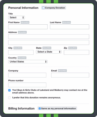
Your donors are busy people! They don’t have time to fill out a long and arduous donation form. Studies show 83% of people who visit your donation page don’t make a donation. In other words, the shorter and easier your form is to complete, the more your donors will actually make it to the end and submit their donations.
While it can be tempting to use your form to collect as much information on your donors as possible, keep required fields and questions to an absolute minimum. If you wish to contact your online donors further, do so through email newsletters, periodic surveys, and other communications.
Takeaway: Keeping information fields simple and easy to fill out is an important part of creating a pleasant donor experience that will result in more donations down the road.
#11. Streamline the process
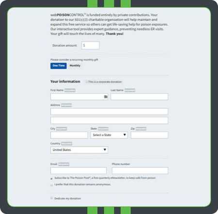
One-page donation forms have a much higher success rate than those with multiple pages. Why? Forms kept to one page include fewer steps, resulting in an easier online giving process.
Your organization should aim to capture all necessary data in just one page. Keep the number of required fields to a minimum, and you should be golden. If a one-page donation form isn’t possible, be transparent about how many pages there are. Your donors want to be able to gauge their progress within the process.
Takeaway: Make the online donation experience as quick and direct as possible by keeping your donation form one page.
#12. Offer different giving levels
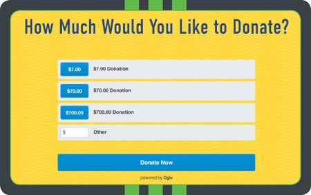
Offering different giving levels results in slightly higher donations. That’s because giving more is as simple as clicking a button, and when options are suggested, many of your donors will be influenced by the social factor and want to appear more generous. Giving tiers simplify the giving process and help you raise more.
When setting gift amounts, you’ll want to factor in your campaign goals, your donors’ average gift sizes, and the gift amounts featured on comparable donation forms to set gift levels appropriately. Make sure to let your donors know exactly how they can further your cause by linking up each gift amount with quantifiable results.
Takeaway: Offering predetermined amounts makes the donation process simpler and can result in higher donations.
#13. Offer other giving options
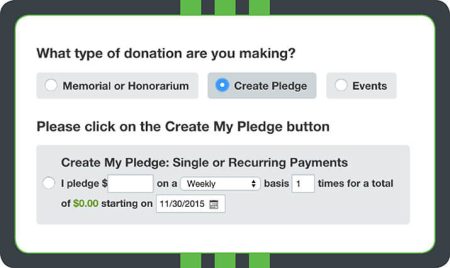
It’s more than likely that your organization has many different projects to fund, from events to buildings to anything else. It’s a good idea to include all of these options on your form so donors can give to the causes and projects that they care most about. When your donors can get involved how they want to, they’ll be more inclined to do so!
You can design your form so that your donors can choose which projects and funds their money is going toward. This tip can also apply to how donors are giving as well. For example, you could give them the option not only to donate but also to donate in memoriam or honorarium or make pledges to give at a later date. Just remember to strike an even balance between offering multiple choices and keeping your form simple. Too many choices can be overwhelming.
Takeaway: Providing your donors with choices (both in regards to where their gift is going and how they make that gift) empowers them to give on their terms.
#14. Attach tangible impacts to donation levels
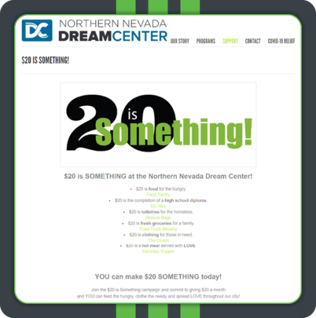
As you know, offering different giving levels can result in increased donations, but what do those giving levels mean exactly? Provide a tangible impact for each donation level, giving your supporters a more concrete idea of how they are helping your cause and furthering your mission. Allowing donors to visualize exactly what their donation will do keeps them invested in your story.
When you’re creating your online donation form, make sure to indicate the tangible impact right next to each suggested giving amount. Be as specific as possible. For instance, instead of simply saying, “A gift of $20 will help the hungry,” you can say, “A gift of $20 provides homeless people with food, toiletries, and more.”
Takeaway: Further connecting your donors with your organization’s story and journey toward your mission keeps them invested and sets up the foundation for future engagement.
#15. Offer and encourage recurring donations
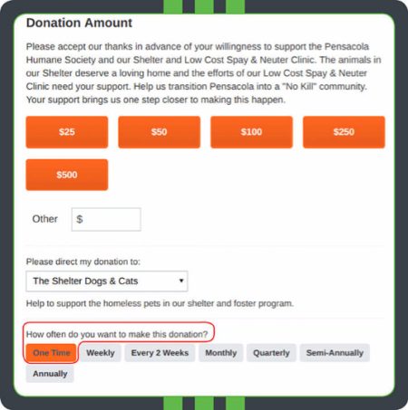
Recurring donors are some of the most lucrative contributors for nonprofits! Think about it: A donor who gives regularly can donate much more to your nonprofit than a one-time donor possibly could. However, not all of your donors will be aware of the option to set up recurring giving. By encouraging recurring gifts on your donation form, more of your donors will be aware of this option, and they’ll have a convenient way to get set up.
With online giving software, your nonprofit can easily give donors the option to set up recurring giving by placing a field on your form. Provide donors with multiple options (for example, monthly or annually) so they can choose the option that’s most convenient for them. When donors have the flexibility to choose their own involvement, they’ll be more likely to become longtime givers!
Takeaway: When you give donors the chance to decide when and how often to donate, they’ll be able to make those contributions consistently.
#16. Provide matching gift options
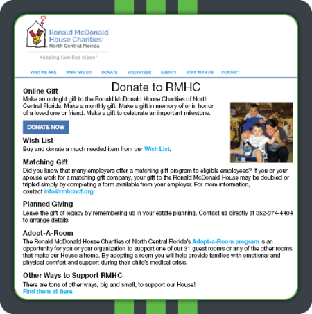
Did you know that an estimated $4-7 billion in matching gift funds go unclaimed each year? This is not only due to the donor not knowing if they’re eligible but also because many organizations don’t promote matching gifts enough. Adding a matching gift option within your online donation form will help increase your fundraising.
A simple way to advertise matching gifts within your donation form is to include detailed instructions on what a matching gift is and how to submit one within the donation page itself. Make sure to provide your supporters with all the necessary information, like contact details and a deadline, so they can double or even triple their donation.
If you want to take it a step further, embed a searchable matching gift database within the form. This way, your donors can quickly look up their employer to see if they’re eligible and receive the necessary guidelines dependent on their company’s program. After all, some of your supporters probably have no idea they can even submit a matching gift!
Takeaway: To further increase fundraising, promote matching gifts in more places than just your donation form. Send out emails and other marketing materials to encourage past donors to inquire about their own matching gift status.
#17. Add GiftAssist
Your donors want to help your cause as much as they can, which is why many of them are willing to cover processing fees for their donations. By covering processing fees for their donations, your donors can feel good knowing your organization won’t have to spend a little extra on processing instead of on your mission.
Use a fundraising software that allows you to turn on GiftAssist. A little checkbox will appear on your donation forms, and all your donors will have to do is check the box to cover the processing fees for their donation. Plus, you can add an extra thanks to your donors who use GiftAssist in your receipts.
Takeaway: Save money on processing fees by providing your donors the option to cover them for you.
#18. Experiment with different submit button text
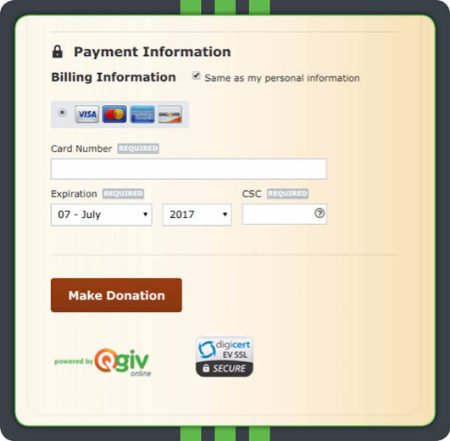
A donation to your organization is so much more than a mere transaction; it’s a contribution to a worthy cause! Tweaking the language on your “submit” button can put it into your donors’ minds that they’re giving to a good cause, which makes the process seem more meaningful. It’s a small detail that can make your form that much more compelling.
Instead of just featuring the word “Submit” on your button, use more vivid language that makes it clear that your donors are, in fact, making a donation. Even language as straightforward as “Make a Donation” or “Donate Now!” can make your form more impactful. You can also get creative and make the language more specific to your organization.
Takeaway: Try using a different phrase on your donation button so your donors feel like they’re truly giving to your organization!
#19. Offer different payment options
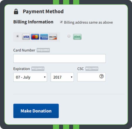
Giving your donors different ways to make their donations online is vital to enhancing the online giving experience. Including all of the payment options you accept will make giving more convenient for your donors because they’ll be able to choose the option that’s viable for them. Digital wallets, such as Apple Pay or PayPal, are great options to help speed up the donation process for your donors. The more options you include, the more of your donors’ giving preferences you’ll accommodate.
On your form, list all the payment methods your nonprofit can accept. For example, include icons of all the credit cards you can process, and give your donors the option to donate through eChecks or digital wallets as well. While the number of options included will depend on your organization’s resources, the most important thing is to make these options clear!
Takeaway: Provide as many payment options as possible on your nonprofit’s donation page to encourage giving.
#20. Allow donors to create an account
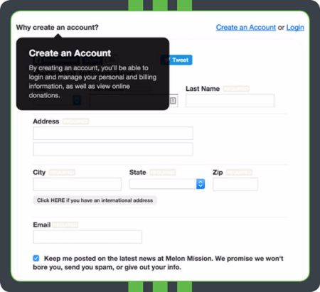
Giving your donors the option to create an account can make the online giving process easier for both your organization and your donors. When your donors create an account, your organization can better keep track of past giving history. Additionally, your recurring donors won’t have to fill out your form more than once, which makes online giving more convenient. It’s a win-win!
Using your online giving software, provide your donors with the option to create an account using the information they’ve submitted on their form. The one caveat here is that creating an account shouldn’t be mandatory. Some of your donors might not feel comfortable with your organization saving their information, so if they feel like this step is required, it might deter them from making a gift.
Takeaway: Offer your donors the option to create an account so that submitting future donations is a breeze for them, and keeping track of giving histories is a breeze for your nonprofit!
#21. Provide other ways to get involved
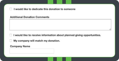
Chances are, there are many ways that your donors can get involved and support your nonprofit.
Providing your donors with information about different ways to get involved gives your donors more flexibility when it comes to giving and ensures that they’re aware of the different ways they can support you. When your donors can choose their own involvement based on their preferences and affinities, there’s a greater chance they’ll contribute!
Although your organization should aim to keep your form as short and simple as possible, don’t forget to include fields that highlight other ways your donors can get involved. For example, depending on what programs you have, your organization might include information about planned giving, corporate giving programs, volunteering, membership programs, or peer-to-peer fundraising. Feature your most important initiatives and those that are most likely to appeal to your donors.
Takeaway: Including information about other ways to give on your donation form will result in higher levels of donor engagement since your donors can pick the options most interesting to them.
#22. Use multi-step forms to chunk information
When it comes to donation pages, the simpler they look to use, the more likely your donors are to complete their transactions. Extra fields often make people feel like filling out the donation form will take up too much time, which can lead to them not finishing their donation transaction. However, sometimes, you need to collect more information from your donors.
To avoid missing out on donations, use multi-step forms when collecting additional details from your donors. Chunking the information your donors see at one time makes the form seem quicker and easier to complete, even if there are more fields to fill in.
Takeaway: Your donors want their giving experience to be as quick as possible, so use multi-step forms to keep them from being overwhelmed by form fields.
Event registration best practices
#23. Make event registration simple
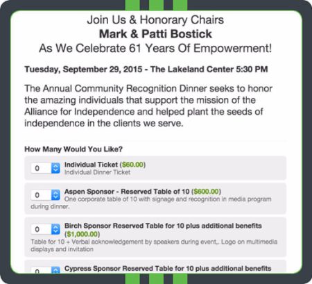
Your online donation page can be used for all types of fundraising—including events! As with your donation pages for standard fundraising, you should make your event registration forms as intuitive and simple to complete as possible for your donors. When registering for your fundraising events is easy, you’re sure to see an excellent turnout!
When designing your event registration form, the same rules as your standard donation form apply. Keep required fields to a minimum and be sure to spell out exactly what your donors’ contributions are going toward. Feature multiple registration tiers (single, couple, VIP, etc.) so your attendees can pick the option that makes the most sense for them.
Takeaway: For the biggest turnout at your event, make sure your event registration form is just as easy to complete as your donation page.
#24. Provide clear & concise instructions
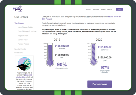
Whether you’re hosting an in-person fundraising event or a virtual experience, you need to provide clear and concise instructions for participation. For instance, do you require a ticket purchase, or are you raising money before your event through a peer-to-peer method? Your event attendees are important supporters of your cause, so don’t leave them in the unknown with a vague event registration form and description.
Within your online donation page, include instructions on how to participate in your event, how to support the event, and what the event will ultimately accomplish. For instance, if you’re fundraising before the actual event day, embed a fundraising thermometer to display the event’s current progress. This shows your supporters just how much has been accomplished and can further encourage them to participate!
Takeaway: To maximize participation and support for your upcoming event, it’s crucial that your participants understand the event’s true purpose and their role in it.
Thank-you page best practices
#25. Plan for what happens after the donation
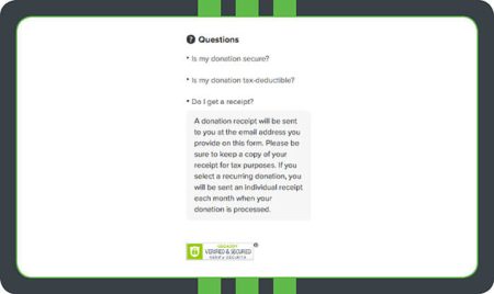
Your relationship with your donors doesn’t end the minute they click the “Submit” button.
To properly acknowledge and cultivate your donors after the donation, keep a developed stewardship plan in place. When you have a plan from the beginning, your organization can more effectively transform one-time donors into recurring givers, which means more donations for you in the long haul!
After your donors make a gift, set up your online giving software so they land on a branded acknowledgement page. You can also automate receipts so your donors will always be certain that you’ve received their gifts.
Takeaway: Building relationships with your donors is crucial for your retention efforts, so use your donation form as part of your stewardship plan!
#26. Customize receipts to share your gratitude
Your receipts don’t have to be generic. By customizing your receipts, you can add personal touches to your communications with your donors while sharing your gratitude. As a best practice, you want to thank your donors within 48 hours of receiving their gift.
Create custom receipts for different types of donations that thank your donors for their support. Use tags within your customizable receipts to automatically include your donor’s name on their receipt to add a personal touch. You can also add a conditional thanks for any of your donors who used GiftAssist to cover their donation’s processing fee for you.
Takeaway: Gratitude helps you make your donors feel good and more likely to give again, so segment and automate your thanks with your donation receipts.
#27. Allow donors to share their donation on social media
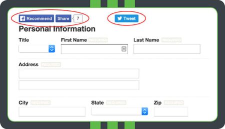
Adding the option for your donors to share their contributions on your donation form is an organic way to spread your reach! When your donors share their contributions, the hope is that their networks will be inspired to join in and start giving, too. Plus, many people like to share their philanthropy with their friends and families, so you’ll also be creating a better giving experience for those who wish to share.
Adding social sharing buttons is made much easier when your nonprofit uses online giving software. Most platforms allow you to place buttons on your form that donors can click to share their contributions on various social media sites. Include sharing options for all the sites that your donor base is most active on and encourage sharing from the outset by placing these options at the top of your page.
Takeaway: Offering social media sharing buttons on your donation page can help you increase your organization’s reach and potentially acquire new donors.
#28. Add calls-to-action to your acknowledgment page

Calls to action serve as important cues to your donors. They let your donors know how they can further engage with your organization and direct them to where they can interact with you further. If you want to keep building relationships with your supporters after their initial transactions, the best and most immediate way to do so is by including a call to action on the donation acknowledgment page.
Calls to action come in all shapes and sizes. Your organization could request anything— from subscribing to your email newsletter to registering for an upcoming event. It all depends on which action would be most valuable to you and your donors. Whatever action you request, use clear and actionable language, and feature your call to action in a prominent place and standout color so your donors won’t miss it!
Takeaway: Spur further engagement among your donor base by including a call to action on your acknowledgement page.
#29. Include a survey to collect additional information
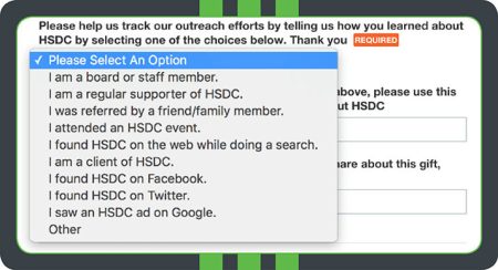
Asking your donors how they heard about your organization can be useful on a number of levels.
First, it helps your nonprofit gauge how well you’re doing at promoting your cause and asking for donations through various channels. Second, it can give you deeper insights into your donors’ preferred communication channels. While this field isn’t required, per se, it can definitely come in handy down the line!
Using online giving software, you can place a field on your donation form where your donors can select how they heard about you. Include plenty of options to get the most detailed insights. However, keep in mind that adding too many additional fields to your form can decrease the number of completed gifts. While this is an excellent question to ask, limit your extra questions to one per form.
Takeaway: Asking your donors how they arrived at your nonprofit’s donation form can give you more astute insights into your outreach strategies and your donor’s preferences.
How to increase traffic to your donation page
#30. Make your website’s “Donate” button visible
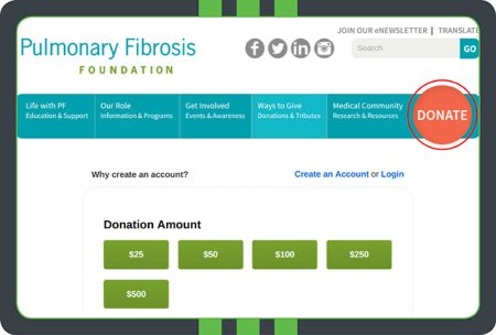
Many of your supporters who want to donate online will approach you through your organization’s website. To provide the best user experience, your donation button should be visible to your donors on every page of your site. When your donors don’t have to search around for a button and can get to the pages they want quickly, there’s a better chance they’ll stick around long enough to make a gift.
Your website’s “Donate Now” button should be prominently displayed across your site, not just on your ways-to-give page or homepage. To ensure it’s ever-present, include it in your top navigation so your donors can spot it immediately. To make your button even more eye-catching, make it large, use a bold font, and select a color that stands out.
Takeaway: By placing an attention-grabbing “Donate Now” button across your website, you’ll increase the chances that your supporters will get to your donation page.
#31. Add a donate button to your social media
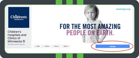
All of your donors should know how to access your nonprofit’s donation form, regardless of how they approach you—and that definitely applies to social media, too! Including the link to your donation page will make it clear to your donors where they can go to submit their donation. And an intuitive online giving process is one that’s far more likely to be completed by your supporters!
How you incorporate the link to your nonprofit’s donation page will vary by social media site.
On Facebook, you can include a “Donate Now” button that links to your form on your nonprofit’s website. If using X, you can post your link during campaigns and include it in your bio. You can include the link in your Instagram bio as well. No matter which site you’re on, the link should be visible to your supporters!
Takeaway: Including a link to your donation page on your social media profiles provides your donors surfing the web with a seamless donation experience.
#32. Incorporate your donation page into your other fundraising strategies
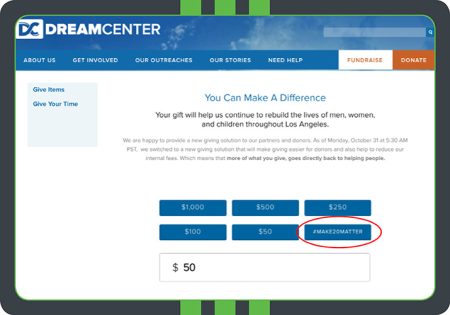
Your nonprofit’s online donation form isn’t a standalone tool; it’s part of your organization’s greater fundraising strategy! To reap the most donations from your online form, incorporate it into your other fundraising channels as well. That way, your donors who receive information and asks from your organization through other channels have the option to follow up online if they prefer.
Your nonprofit should develop a plan of action for incorporating your donation form into your overall fundraising strategy. Your donation form must be cohesive with the look and language of your other communication channels and include information about online giving in offline outreach, if possible. Remember: the more options you offer your donors for making a donation, the more inclined they’ll be to do so.
Takeaway: By seamlessly incorporating online giving into the rest of your fundraising strategy, you’ll hit more of your donors’ giving preferences.
#33. Use fundraising software for donation pages
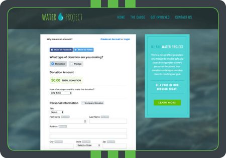
Online fundraising software will make constructing your own donation pages much easier and will provide you with a number of features and benefits, such as:
- Fully customizable and professional forms. Build unlimited donation pages and structure them to your liking with ease.
- Event registration capabilities. Your donors can donate and RSVP to your events in one convenient step.
- Responsive design. Forms are sure to look great and be intuitive to use on every device.
- Recurring giving options. Place a recurring giving option on your form to see higher donor retention rates.
- Seamless integration with your nonprofit’s website. Easily include your form on your nonprofit’s website and collect new donor data.
- Automated receipts. Automate receipts after your donors have given, so your organization has one less thing to worry about!
- Robust reporting and analytics. Track the performance of your form and keep adjusting to improve your fundraising.
#34. Monitor regularly with software
With online giving on the rise, your donation page will be a staple of your fundraising.
In order to see the most success through this channel, your organization should monitor your page regularly to see how it’s performing. Monitoring your donation form is the only way to pinpoint areas for improvement so you can hone your online giving strategies.
Using your online giving software, your organization can run a variety of reports to see how your donation page is stacking up. These reports provide you with deeper insights into your donors’ preferences and where you can improve the online donation experience. Pay attention to the patterns you see and adjust accordingly!
Takeaway: By running reports with your online donation software, your organization can continually improve the online giving experience to see more donations through this channel.
Final Thoughts
Donation pages are often an organization’s first point of contact with new donors, which makes it a powerful tool for donor acquisition and retention. Use these best practices to make a great first impression while keeping your form easy to complete.
Our Favorite Donation Pages
Children’s Hospitals and Clinics of Minnesota uses a simple form with a touching photo to help encourage donations.
CROS Ministries offers donors a choice of where their money goes on their multi-step form.
Big Brothers Big Sisters of Beaver County demonstrates the effect your branding can have on your donation page.
Junior Achievement of Arizona uses impact statements along with images to show donors what their gift can accomplish.
Weld Food Bank keeps users focused on giving with a simple form that offers GiftAssist.
Humane Society of the Pikes Peak Region adds a unique touch by customizing their “Give” button with a pawprint.
Additional Resources
For more information on fundraising with your online donation form, check out these resources:
- Top 8 Fundraising Software Options Your Nonprofit Should Know. Ready to put your donation form to use? Take a look at the best 8 software platforms for every fundraising need.
- Top 15 Online Donation Tools. Double the Donation’s favorite donation tools can help your organization whether you’re large or small. Plus, plenty of these tools can integrate with Double the Donation’s software!
- Text Giving: 8 Steps to Maximize Mobile Fundraising. Put your mobile optimized form to the test with a text giving campaign. Learn about all the details with our guide.


